ShopDreamUp AI ArtDreamUp

Deviation Actions
Exclusive Access Tier
Welcome to my EXCLUSIVE ACCESS TIER!
Here you will have exclusive access to pre-published and published comics/graphic novels that you can only view if bought at full price. Also, you will receive links to be first in line to purchase comic/graphic novels, paintings, drawings, photographs, and prints of my work, view step-by-step pictures/films of my creative process, exhibitions notices, and works in progress.
Thank you for your interest!
$1/month


Suggested Deviants


Suggested Collections


You Might Like…


Featured in Groups


Description
Yesterday, I came across a page from chapter 9 of a manga called Omega.
It hooked me.
I thought that page was so good that that I left a comment saying so.
The creator Elemental Panels told me chapter 1 was not his best work.
I DISAGREE!
I went back and read chapter 1 and a spark of inspiration hit me.
Early morning 9-4-2017 I got up an started to show my fandom by spending my time not on college homework but redrawing the first three pages.
Check out the rest on elementalpanels.deviantart.com… you can find chapter 1 in his gallery.
Page 1
sh-adow-13.deviantart.com/art/…
Page 3
sh-adow-13.deviantart.com/art/…
Image size
940x1307px 411.9 KB
© 2017 - 2024 sh-adow-13
Comments13
Join the community to add your comment. Already a deviant? Log In
Hello! I'm Jessica from ProjectComment to critique your work.
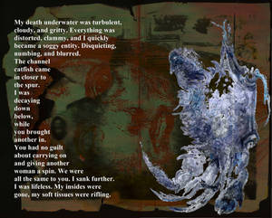
I must admit...the texture really freaks me out, but its the nails digging into the background that takes the cake. First things first, your anatomy is fantastic. Hands are complicated and working with a simplistic style that minimizes some details doesn't take away from the complexities involved in drawing good hands. You've achieved a good balance of providing enough details for the viewer to see a realistic hand and not over working the hand with details to transcend into a more complex style. The simpler style can give you the same quality but with a lot less time invested in the drawing.
The grooves carved into the background are consistent with the nail shape, but with the thumb, it looks like the soft pad is carving a deep groove as much as the nail is. Unless the background is something like room temperature butter, even if the thumb pad was strong enough to carve a groove, it wouldn't be as deep as the nail since there is more give in flesh than nails. Kudos for getting the thumb nail groove angle just right. It shows a lot of thought went into this drawing.
I do think there needs to be more attention to the light source on the bumps on the skin. With a more consistent light source, you'll improve the overall quality of the piece.
As for the composition, I think the hand is perfectly placed, but I'm not quite sure about the lettering. With the title being so close to the drawing and the bottom lettering overlapping part of the hand, it looks a bit scrunched up. Maybe playing around with the placements and/or sizing will produce something that improves the overall harmony of the piece.
I hope I have in some way helped. I think you are on a great path to maximize your talent and I hope to see more of your work in ProjectComment soon.